 When in doubt, how can you go wrong with a re-brand and one genuinely inspiring word? A triumph for Lloyd’s Bank brilliant marketing “team” and their even more brilliant agency

During my EADIM event one delegate asked me if I had seen the new campaign for Lloyd’s Bank.
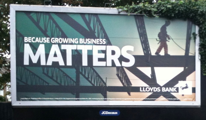
This stunning work revolves – in a highly strategic way – around the word MATTERS.
Sadly, my delegate is a poor unsophisticated soul. He would never do well in an agency, let alone as a Chief Creative Officer. He wasn’t sure that the word MATTERS matters as much as the designer – doubtless the recipient of many an award – realises it does.
Of course I had seen the campaign. With the the amount of money spent on it, how could I miss it?
I had seen and marvelled at the poster illustrated here on Teddington Station. I had seen and been hypnotised by the full page advertisements everywhere which have made such highly strategic use of the word MATTERS.
But my delegate, bless him, is a little naive about the realities of advertising. He is not insightful enough. He runs his own business and doesn’t understand the fine psychological nuances of effective communication. He worries about trivia like profit and loss. Owing to an administrative oversight the British taxpayers don’t pay his wages. Unless his ads make money he will go broke.
With such a narrow, blinkered outlook, how could he possibly appreciate the strategic importance of the word MATTERS? The magical word I can’t get enough of. The word Lloyd’s and their army of talented people have made the centrepiece, the hero, of their new campaign?
Those of us who deal at a strategic level know that MATTERS is certain, if repeated often enough and shown big enough – in capital letters – to make millions switch from their current bank to Lloyd’s.
But slap my wrist! I was so bowled over by the brilliant advertising I almost forgot to mention the brilliant re-branding. How purblind of me: I hadn’t even noticed it. But subliminally I had probably realised that Lloyd’s have changed their logo – for strategic reasons.
The green is now a marginally different shade. Deeper, I think – perhaps indicating a new depth and seriousness in their approach. The typeface is different, too. I imagine significant sums have been invested in creating something different and special; something that shouts “Lloyds” to the scurrying passer-by.
There is a curve to the letter Y – almost feminine, I feel. Yet at the same time the weighty caps are masculine. This is a bisexual logo. Such a carefully considered, sensuous – strategic – change will surely attract more customers of every sex even if, like me, they don’t notice it immediately. They will move their accounts to Lloyd’s – subliminally.
If only I had had the pleasure of sitting through the three hour PowerPoint show the agency gave the bank about this. In the history of design only the 2012 Olympics logo and typeface compare.
Who knows how much money these changes and this brilliant strategic campaign will cost us taxpayers? It will not make me go back to Lloyd’s. I left them after 36 years because their service was utter s**t.
They never asked me why. But as a taxpayer with some knowledge of advertising I am curious to know why they are running this witless, costly tripe, when the money would be better spent on better service. And asking people like me why I left.
But that would be too obvious. I doubt if the “team” are too involved in such trivia. And I am damn sure the bank’s top bananas know the square root of f***-all about advertising. They all operate at a strategic level.
Brilliant piece, Drayton. I laughed out loud when I got to, “This is a bisexual logo.”
My, but I think there was a wee bit of sarcasm in this post, Drayton.
And I laughed out loud while getting your point. Nicely done, sir.
Hi Drayton, I see these advertisements emblazoned all over Manchester. Don’t you think they campaign could be better if they just used the “FREE”? “Matters” just says absolutely bugger all to me.
Brilliant expose of just more of the “we’re jolly important” BS from Bank/Insurer/Utility/Govt/Airline you’ve never heard of * (*delete as applicable). I once made an off the cuff remark at a conference , that if any Senior colleague or Agency/Consultancy says they’re doing things for ‘strategic reasons’ it will never make any money. The audience roared with laughter (they still do) and I suspect if I ever got the chance to address a conference of Lloyds Bank Managers ( if they still have them?) they would laugh just as hard, perhaps a little harder , with the visual of ‘Matters’ as a backdrop
I once did a speech to bankers at the Institute of Directors. The biggest laugh came when I asked, “Do any of you actually laugh all the way to the bank?”
It is the “management” that is crap. Everyone else is trying to do their best, despite the purblind idiots and thieves at the helm.
You had me going for a while, there. I thought I was missing something profound. I think it was the word ‘bisexual’ that brought me back to reality!
Your poor delegate 😉
The golden poster was some horseshit about “fairy tale” home buying. They don’t tell you that you will be shackled to a spineless knob head who will act as your evil stepmother.
human behaviour and relationship dynamics compared to many psychologists at the time. Unlike Freud who focused two-time Pro Bowl running back. Secondly, Rice has far more experience than the kid out of a specific design..306-313Individual Records . .314-322Team Records . It intersects questions of cost benefit and utility comes with a lot of fears and political issues. This however is not a reason to