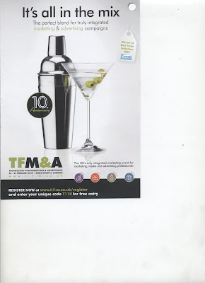
 Let me ask you. When you see this picture for a couple of seconds, what do you think of?
Could it possibly be cocktails?
I thought so.
Now, remember, most marketing messages are only seen for a couple of seconds.
So if, for example, you are trying to get people to come to a marketing event, showing them a picture of a drink is pretty damn stupid.
And, yes, you’ve guessed it: this is a message trying to attract people to come to a marketing event.
Years ago the Ogilvy Centre for Research did an extensive study of what people think about when they see an illustration.
You might assume that any bloody fool would know that when people see a picture of something, that’s what they think it’s about. But this blindingly obvious fact is lost on the dear little creatures who create so many ads like this.
Sad, really.
Drayton,
A simple but very profound point. Goes right back to basics and the purpose of the headline or the mechanism to attract attention (which is what the picture is here). Pretty much everyone is going to think “Cocktails” and when they find out it's about a seminar they're mostly going to pop this ad into the mental rubbish bin. People interested in a seminar, on the other hand, will most likely not give this a second glance.
BTW, any thoughts on the Google Superbowl ad?
Thanks for the post!
Never saw the S-bowl, Kevin. Fast asleep here in London! Shamne; seemed a good game. I always suspect the people most interested in the ads are marketing people. The biggest annual discharge of effluent into the US sewage system coincides with the most expensive TV spot of the year – at half time. A moral there.
LOL! As always, you've nailed it in your inimitable style! A vision of huge amounts of money (and other things) being flushed away!
Think you're right about the marketers being more interested in the ads than the punters in most cases. However, the Google ad has attracted a bit of interest on copy blogs even though it's not strictly a direct response ad. Nice example of a story based approach.
Thanks again!
I have now watched it. It is very good for one simple reason. It demonstrates. Demo commercials do very well because, as Claude Hopkins said in his first book, “Do what a salesman would do.” I generally think the Monster spots are the best. I saw their CEO talk about them when I was at Yanik Silver's do in Washington this time last year. They certainly get results. I do think, despite my sewage joke, that there are some pretty good ads because people really put themselves out on these ads.
Now I come to think of it, there is a mistake in the commercial:it is tu est mignon, not tu es; and as my partner just pointed out, the Google spot has another important attribute: charm. And I was talking crap just now: it is the Go Daddy CEO I saw talking. Ah, senility!
Drayton,
Thanks for your comments on the ad. Great points.
Alas I beg to differ on the french spelling / grammar issue. It would be “Il est” or “Elle est” but “tu es” is the correct for the 2nd person singular (and familiar), I believe http://www.frenchlanguageguide.com/french/languagetools/etreverb.asp)
Know what? I AM senile. I had two houses in France for years, spend lots of time there, speak the lingo enough to fool the odd drunk – and got that wrong. Time to shuffle off to the nursing home, but I'm flying off to check out the snow in New York this morning. I'll probably end up in the wrong country.
As the google ad has a male American trying to chat up a little French number it actually should be 'tu es très MIGNONNE'.
Sank 'eavens for leetle girls…….
C'est vrai, Rupert.