Schools, shoes and cliches: what I saw in New York – and when I came home
As usual I must apologise for my shaky hands, bizarre sense of perspective and complete lack of any vestige of a clue about composition.
However, if you’re interested in messages that sell, all these posters have lessons to teach. Often the case, because to compress a message into a few words on a poster takes real talent.
So here goes.
The most famous resident of Montclair, New Jersey is the great sports coach Yogi Berra, faned for his bizarre statements, who said “You can observe a lot just by looking.”
So here are two posters for colleges that I saw on Walnut Street station in that fair town, where my youngest daughter lives.
Both are bad in their way. That’s because they rely on the theory, much loved by bad ad agencies and their clients, that lots of teeth represent an idea. They do not, even if buttressed by select cliches like “See yourself” and “We are”.
On the train from Walnut to Penn Central I saw the gentleman who is so pleased with himself because he thinks everyone is interested in what his firm’s “game-changing” advice might be.
This might well be a forlorn hope, even in an ever-changing world, but for the fact that most other advertising in this field is utterly appalling. So probably this is a good investment.
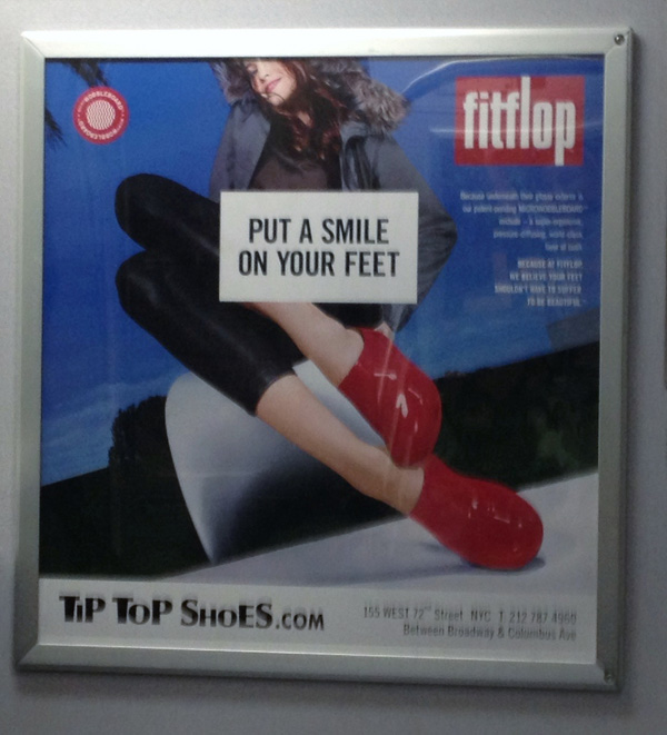
Things got even better when I took the F train from Brooklyn to LaGuardia en route to make a speech in Florida and saw the Fitflops poster. A great line for shoes that are comfortable, though an ugly picture.
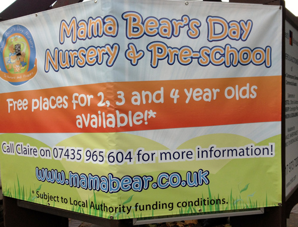
The best poster of all greeted me when I got back to Clifton in Bristol where I live. It does everything a message can hope to do.
The visual is right. The typeface is right The copy is right. The branding is right. Who wouldn’t want their child to be cuddled in the fairy-tale world of Mama Bear?
The poncey ad agency luvvies will never give this an award. But I do.
