From one of the best advertising campaigns ever to a deer in the headlights. Where did it all go wrong?
Being an old fart I cannot resist the thought, manfully though I try, that things were better in my day.
This is, by and large, all balls for a number of reasons.
I doubt if many people now live the way folks did 58 years ago when I moved into my house at number 175, Katherine Street, Ashton under Lyne (£775 freehold – and we overpaid).
The toilet was outside in the yard, where I used to fall asleep after too much Lutomer Reisling (40p a bottle) and where my wife Pam hung the washing. The yard, I mean, not the toilet. The washing would get covered with little black spots from all the coal fires.
We were the only ones in our row with a bath, which our neighbours would come and ask to use.
We were thrilled with our little black and white TV and its two channels (for some reason many of the programmes assumed you were not an illiterate moron).
Another reason it’s balls is simple. To my surprise, it’s still my day, so to speak.
The internet whiz Doberman Dan rang me up the other day to talk about doing a podcast. He asked if I still write copy. I do – in fact I wrote three pieces that morning.
I am tempted to say I’m not as good as I once was but I’m as good once as I ever was, though that’s open to debate.
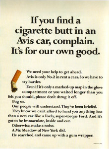
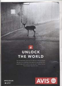
More to the point, I think there has been a precipitous decline in advertising since 1952 when Doyle Dane Bernbach produced the ad on the left until now when the load of steaming crap on the right was excreted by some witless crew and approved by a “Chief Creative Officer”.
The slogan “We Try Harder” – one of the best ever written – was used for 50 years before a re-branding in 2012. At that point Avis – or whichever incompetents they overpaid – devised a new slogan, “It’s Your Space.”
Hello? Did they decide to go into the real estate business? Who knows? But you can be damn sure of three things.
First, there were lots of meetings involving far too many people with tiny brains, no knowledge of communication and nothing better to do.
Second, a huge pile of jargon-encrusted waffle was produced to justify this inane decision.
And third those responsible were idiots.
If you want to know why those old ads were good, why Avis shot from nowhere to success, and what’s wrong with business today read “Up the Organisation” by Robert Townsend. One of the wisest, shortest and most entertaining books about business ever written.
In 1966 and later I worked with people from Doyle Dane Bernbach and Ogilvy who were in those agencies in that Golden Age. They helped turn me into someone who can still write copy that sells after 50-odd years.
If you want to know what I know join me in October in London.


Mr Bird, while I agree that the ‘Unlock the world’ ad is pretty dreadful, it still appears to use the same ‘We Try Harder’ slogan. Would it be cheeky to suggest that perhaps you had better eyesight in your day? 🙂
It may well do, Lewis (and I did) but the company, not I, said it was changing its slogan two years ago. Maybe they had second thoughts.
The campaign itself is better on TV but suffers from a fatal flaw. It sells the joys of travel. Unless you have over 50% of the market, not very clever.
My criticism is at the level of ideas, logic and simplicity.
The old ad has one simple idea that it states in the headline and then elegantly develops through the copy: ‘tell us what’s wrong and we’ll put it right, which helps you.’ The imagery throws its weight behind this endeavour.
The new ad starts with a vague, nebulous premise (‘unlock the world’). Immediately abandoning that theme (whatever it is), it then looks to engage us with a premise, presented as as truism, that we’re supposed to agree with (‘the unexpected is good’).
The imagery is linked to this premise, but turns out to be irrelevant because the copy then turns left again (‘but so is the expected’), completely wrong-footing us once more.
Finally we arrive at the benefit (choice), which should have dictated the headline and the image.
The payoff (‘You’d expect that from Avis’) is self-satisfied and presumptive, and a missed chance to say something about car rental, which is in theory the subject of the ad.
Adding insult to injury, there are two instances of sentences separated by commas, but clearly nobody cares about such things any more.
Another big difference: the ad on left uses a serif font, and is easily readable. The ad on the right is a sans serif reversed-out on a dark background that tells you next to nothing about Avis.