Oh, and make sure people can see your brand name
On the last day of EADIM I spent a few minutes going through ads I found in the Evening Standard.
I may be a grouchy old bustard, and old men forget, but I honestly think people have less of a clue about what makes good ads than they did in days of yore.
There was barely an ad in the paper that was even reasonably competent.
Hardly anybody seems to realise that if you don’t promise a benefit almost instantly you will fail; and even those who do are unaware of some pretty basic things.
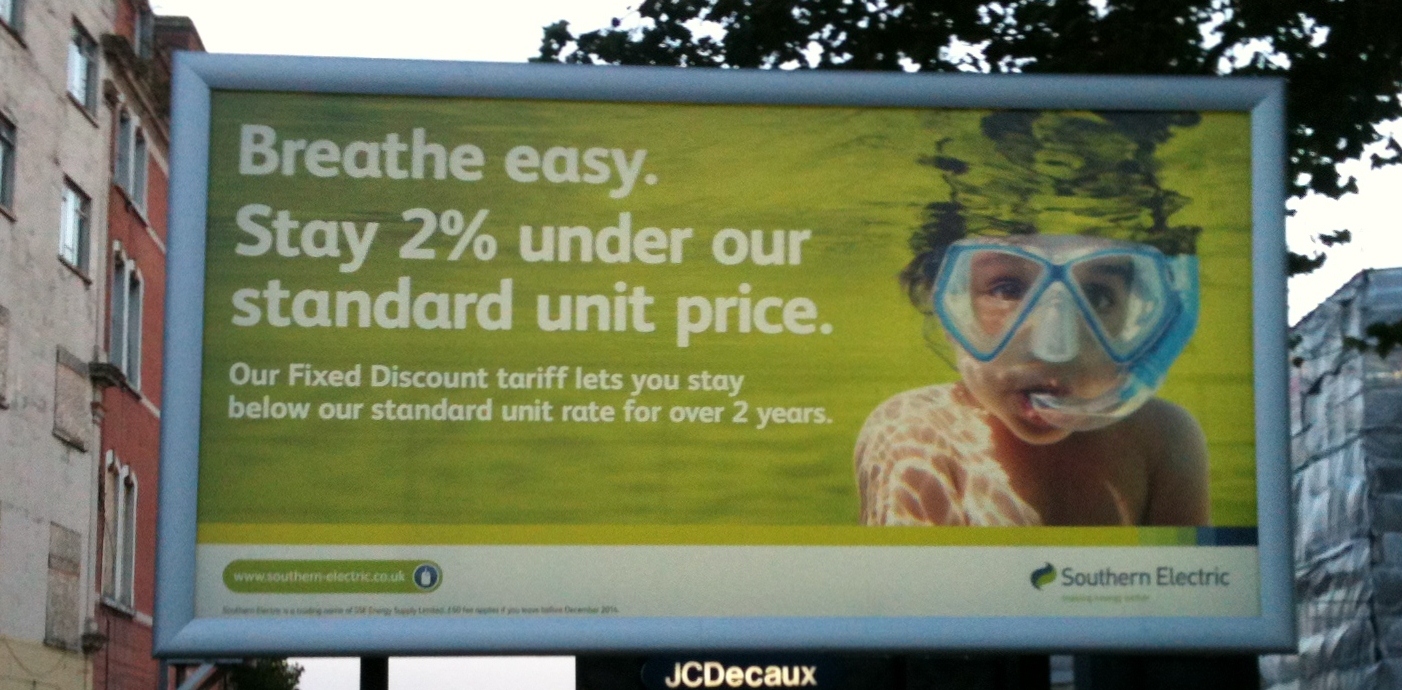
Take this poster.
A team at an advertising agency laboured long and hard on this. It was probably reviewed many times.
But when people catch a glimpse of a kid in goggles underwater this does not suggest electricity. It suggests a kid in goggles underwater.
And when people can’t see the name of your brand almost instantly – which a motorist whizzing past couldn’t – you might just as well throw your money away.
Of course, the utility companies don’t give a hoot anyhow. They just keep raisng prices then offering deals to make it seem less painful.
And I’ll tell you something else. Does anyone know what “our standard unit price” is? Nobody.
Doesn’t it make you suspect there’s something dodgy about that offer? Come to think of it, what exactly are they promising? Any idea?

I love this one – the metaphor is classic!
We’ll hold your head underwater and barely let you survive by breathing through a tube! And you better act grateful for the tube or we’ll take it away.
The only thing that would make this ad better is if it was a government agency instead of a monopolistic power company!
If I read this correctly, it’s a lousy offer as well! Does a 2% discount sound exciting to anyone? Probably not, I’d suggest. Perhaps the creators of the ad realised that and thought that using some corporate gibberish would make it sound more exciting. And what’s with the full stops?
Thanks for the post Drayton and looking forward to your presentation in Sydney next week.
I couldn’t agree more. A lousy offer which is incomprehensible
This is what DM people mean when we warn about the dangers of using ‘humour’ in advertising.
At first glance, honestly thought it’s one of those crappy investment ads.
The point is well made Drayton that this is a billboard, so the target is the motorist, who by definition will take in less as they scoot by, so the connection between the visual, the offer & the company have to be front & centre … here we have dis-connect, no-say and hidden.
Like haute couture, lots of agency inner circle self serving ooo’s & aaaa’s but ultimately less use than tits on a hog. Or a chocolate fireguard. Or an ashtray on a motorbike.