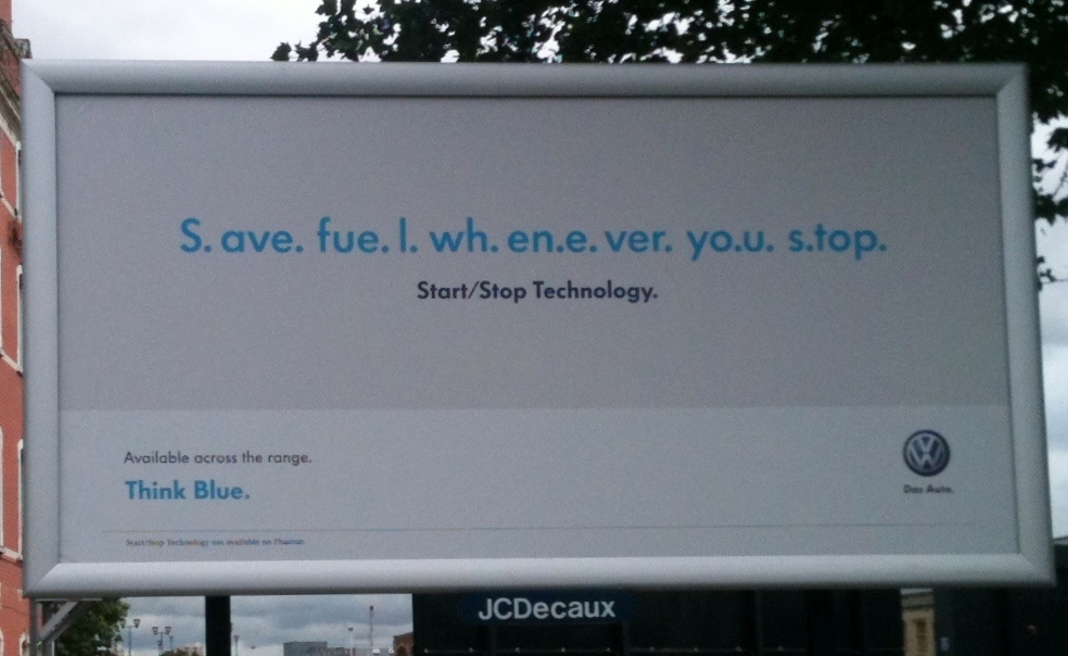
Brilliant poster; stupid slogan; and an ad that throws away a good story

I apologise for my usual tatty reproduction of these deathless works of art.
 Actually, I don’t. Your customers do not see them in a pristine condition the way preening, self-absorbed agency folk do.
They do not scrutinise them solemnly in smart meeting rooms the way the marketing moguls do.
They treat them with utter disinterest, more concerned with more important matters, like whether they remembered to buy more toilet paper.
These two interested me, though. The one at the top is, as you can see a poster. The wrinkled mess below it is actually an ad from a free paper in Bristol.
This VW poster is just excellent. You don’t need telling why, though perhaps you do need telling one reason: other cars offer the same feature – but they don’t advertise it.
If you’re the only one or the first to tell the story, or even if you tell it better than anyone else you pretty much own it.
But it is worth pointing out VW’s massive mistake in positioning.
Audi built a brand by using a slogan in German, which implies quality to many. It is very foolish to copy it with a weaker line – Das Auto. Very close to advertising your competitor.
The other ad I show as an example of the utter unwillingness of a lot of ads to get to the point.
Local papers have a good story, as I happen to know from testing. Ads in them are heavily read and get good responses.
This ad has a visual technique – the cartoon – which is very good at attracting readership. But does a smiley on a chart make the best of what cartoons can do? What is appropriate about handwriting? It’s just there because someone said, “Tell you what – let’s have it all in handwriting.” And someone else said, “Yeah, great.”
And then they cobbled together a needlessly obscure headline. What’s wrong with saying ads in local papers work up to 80% better? And then explaining why? Maybe with a testimonial or two?
I recall one of my writers doing something clever like this ad.
When I remonstrated he said “Let me explain”.
I said “Unfortunately the exigencies of commerce mean we cannot afford to send you round in person to every f***ing reader and explain what the hell was going on in your tiny mind when you came up with this abortion.”
In those days I was not quite the loveable pussy cat I am now.
Agree with you on the ads but worth pointing out that VW also own the Audi brand and therefore could be argued that their advert is extra clever for getting more bang for buck.
As I have worked for God alone knows how many car brands, including those two, I can promise you are wrong.
I don’t think this second ad misses the mark. Testimonials are so boring few people ever stop to take a look. (Let’s face it, no company ever featured a negative testimonial, so people are trained to discount them.) And before I can sell you with all my right-brained arguments, I have to get your attention. I’m not against using a testimonial or two, but nothing fresh to catch the eye. Both of these ads break through the clutter and will get noticed. Hard core DM selling is for another day.
I have lost count of the number of times someone who doesn’t write to get sales thinks classic direct marketing copy doesn’t work any more. As the great John Caples – whom I imagine you have never read – remarked in an interview with the Wall Street Journal, “Times change; people don’t.” David David Ogilvy observed many times that most of the advertisements he saw would never run if the writers had ever had to write to get sales. Every month for my very modest business to stay afloat I have to generate £40,000 all from copy that sells. And what are your qualifications?
I like the VW advert — effective and to-the-point.
The newspaper ad — well I only read the headline and fell asleep…
VW advert is far from excellent. The message is clear and to the point, but the agency who did this ignored the practice of using recognisable text as adviced by most ad & marketing experts (including Drayton). Placed on a dual carriage way near to work, it was on my 4th time i passed the VW ad, that i managed to finish reading it. The stops break up the patterns in the words, so you have to physically read it rather than recognising the words.
Das Shit
That is a flaw, I agree. It depends on siting but my partner who was driving up to Manchester saw that poster and immediately said “That’s a great poster”.
I still have a picture of a 40 sheet poster denoting how easy it was to connect to the Internet. The original said:
Piece@Cake
Demon Internet…
Unfortunately, one sheet fell off, and the thousands passing the poster on the way to Wembley (and a Spice Girls Concert) could only see:
Piece@Cak
Demon Internet
We still landed a paying customer for £30 on average… though the 40 sheets and cross tracks made us have to work harder elsewhere to keep that score.
Now I really am confused. What ever happened to “Make a big promise” and “Unique Selling Proposition.
]
screw being creative. I am telling my customers, “Eat More, Pay Less” and Be Stronger, Feel Good Longer” and I’ll test to see if anyone takes a bite. sn